> ## Documentation Index
> Fetch the complete documentation index at: https://novu-c5de82d9-docs-homepage-redesign.mintlify.site/llms.txt
> Use this file to discover all available pages before exploring further.
# Novu Inbox — In-App Notification Component for React
> Integrate the Novu Inbox component for real-time in-app notifications in your application. Drop-in UI with bell icon, feed, and preferences.
Add real-time in-app notifications to your application with the Novu Inbox component. Install a client SDK such as [`@novu/react`](/platform/sdks/react), render the [``](/platform/inbox/setup-inbox) component with your application identifier and subscriber ID, and Novu handles delivery, unread counts, and preferences.
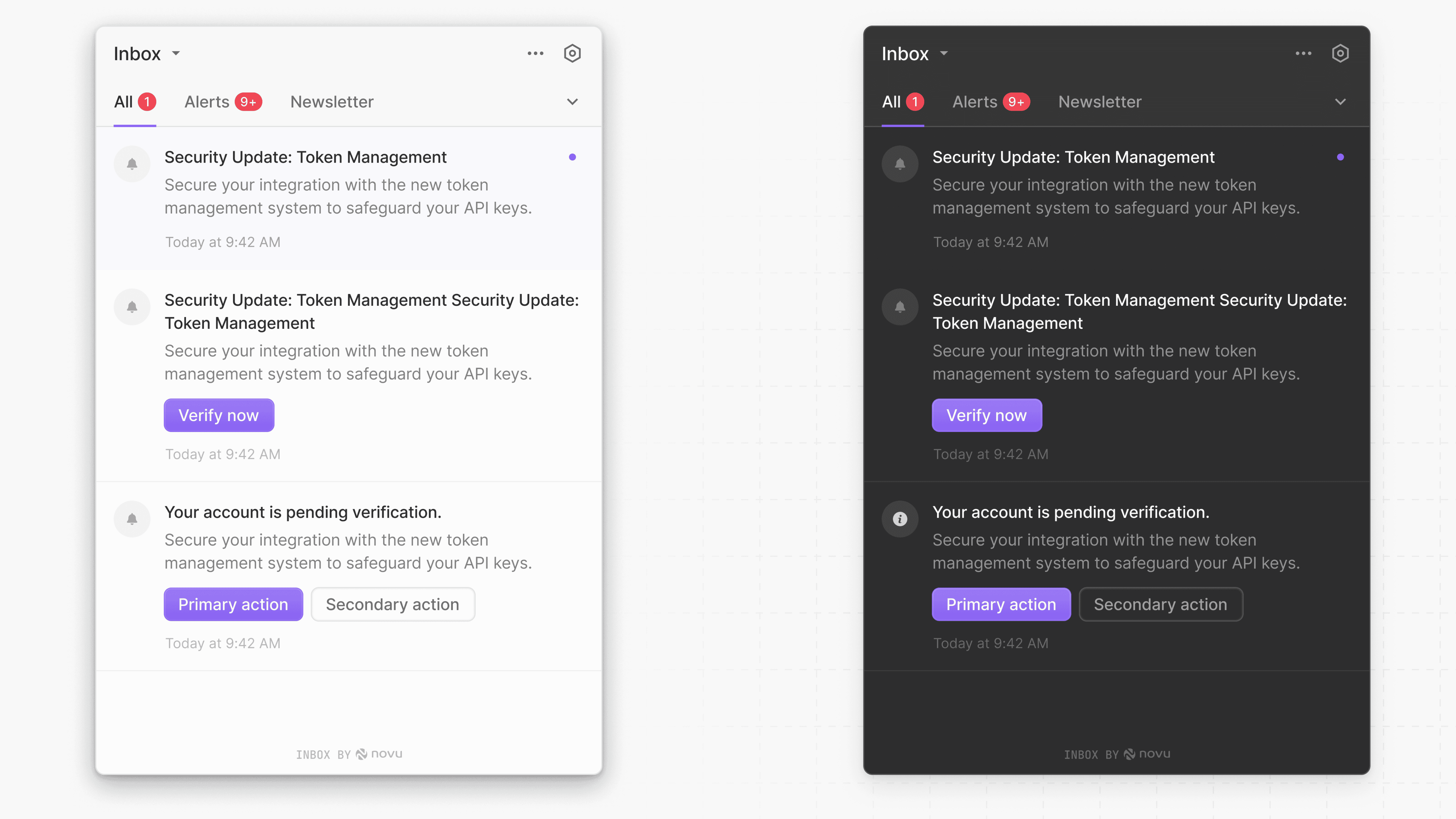
The Novu Inbox is a prebuilt, ready-to-use, and fully customizable UI component for delivering real-time in-app notifications. It gives your subscribers a centralized place to view and manage notifications.
 ## What is the composable Inbox architecture?
The Novu Inbox is built with a composable architecture. It is composed of other sub-components:
Used to display the bell icon and trigger the notification component when clicked
Displays the notifications list
Displays the content of the `` menu
Used to display the preferences modal
## What is the composable Inbox architecture?
The Novu Inbox is built with a composable architecture. It is composed of other sub-components:
Used to display the bell icon and trigger the notification component when clicked
Displays the notifications list
Displays the content of the `` menu
Used to display the preferences modal
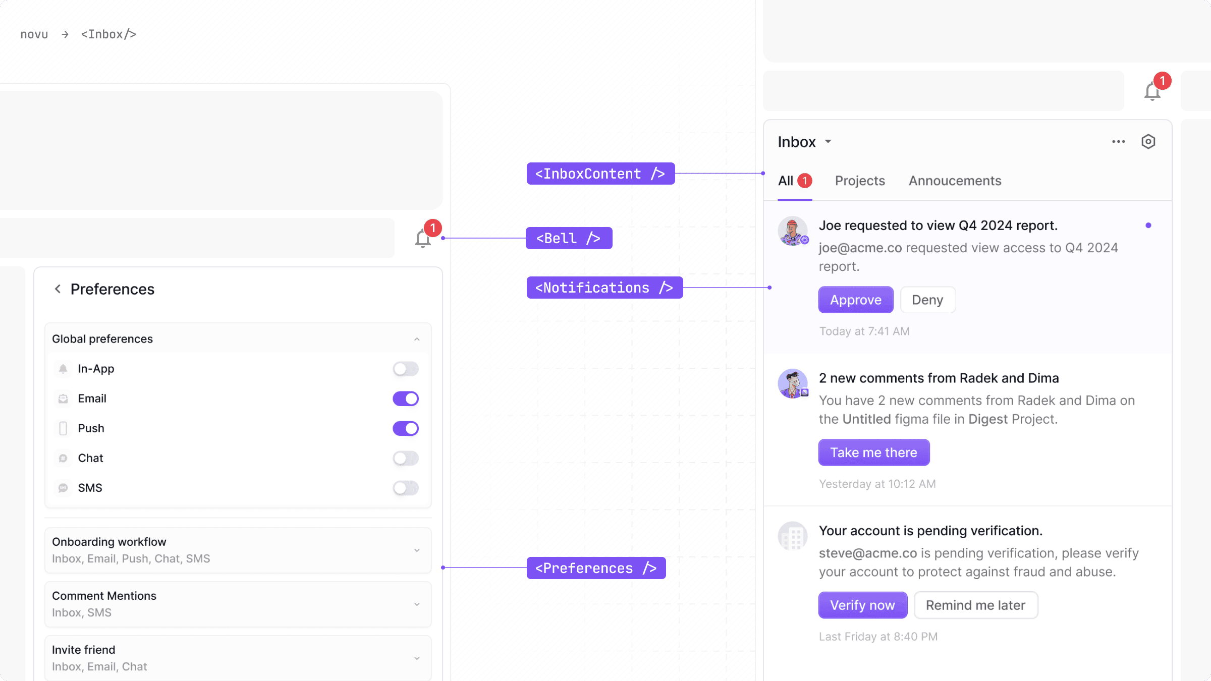 By composing these individual components, you can create multiple popular inbox layouts that fit perfectly within your application's design.
To aid your design process, we provide a [free Figma file](https://www.figma.com/community/file/1425407348374863860) that contains all of the design assets. Make a copy of the file into your own account to get started with customizing your graphical Inbox elements.
## What features does the Inbox include?
* Full stack integration: The Inbox handles UI, unread states, routing, and preferences all in one place.
* Highly customizable: Override styles, replace every UI elements and icons.
* Flexible layouts: Use the default Inbox UI layout or build your own.
* Built-in support for Tabs and filters, localization, snoozing, preferences management, and more.
## How does the Novu Inbox component work?
At a high level, the Inbox abstracts away the complexity of building an in-app notification feed.
1. When you drop the Inbox component into your application, it securely connects to Novu's services.
2. It automatically fetches user notifications and manages the real-time unread count displayed on the bell icon.
3. When a user clicks the bell, it presents the list of notifications and user preferences.
4. All user interactions, such as marking a notification as read or changing a preference, are automatically synchronized with the Novu backend in real-time.
## What are the ways to implement the Novu Inbox?
There are two integration approaches, depending on your needs for speed versus customization.
This is the fastest way to integrate the Novu Inbox. The Inbox component, encapsulate all the UI and logic. You simply drop the component into your application, configure it with the necessary properties, and you're done.
For maximum flexibility and complete control over the look and feel, use the [@novu/react SDK](/platform/sdks/react) for react hooks or [@novu/js SDK](/platform/sdks/javascript) for framework agnostic javascript methods.
You get the power of Novu's notification engine while building a user interface that perfectly matches your application's design system.
## Frequently asked questions
Follow a framework quickstart such as [Next.js](/platform/quickstart/nextjs) or [React](/platform/quickstart/react). Install the SDK, add the `` component with your application identifier and subscriber ID, then trigger a workflow from the Novu Dashboard.
Yes. Override styles, replace sub-components, or use headless hooks from [`@novu/react`](/platform/sdks/react) or [`@novu/js`](/platform/sdks/javascript) to build a fully custom Inbox experience.
Yes. The Inbox includes built-in preference management so subscribers can control which workflows and channels they receive notifications through.
The [`@novu/react`](/platform/sdks/react) package requires **React 18.0.0 or later**. React 19 is also supported. React 17 and earlier versions are not supported.
By composing these individual components, you can create multiple popular inbox layouts that fit perfectly within your application's design.
To aid your design process, we provide a [free Figma file](https://www.figma.com/community/file/1425407348374863860) that contains all of the design assets. Make a copy of the file into your own account to get started with customizing your graphical Inbox elements.
## What features does the Inbox include?
* Full stack integration: The Inbox handles UI, unread states, routing, and preferences all in one place.
* Highly customizable: Override styles, replace every UI elements and icons.
* Flexible layouts: Use the default Inbox UI layout or build your own.
* Built-in support for Tabs and filters, localization, snoozing, preferences management, and more.
## How does the Novu Inbox component work?
At a high level, the Inbox abstracts away the complexity of building an in-app notification feed.
1. When you drop the Inbox component into your application, it securely connects to Novu's services.
2. It automatically fetches user notifications and manages the real-time unread count displayed on the bell icon.
3. When a user clicks the bell, it presents the list of notifications and user preferences.
4. All user interactions, such as marking a notification as read or changing a preference, are automatically synchronized with the Novu backend in real-time.
## What are the ways to implement the Novu Inbox?
There are two integration approaches, depending on your needs for speed versus customization.
This is the fastest way to integrate the Novu Inbox. The Inbox component, encapsulate all the UI and logic. You simply drop the component into your application, configure it with the necessary properties, and you're done.
For maximum flexibility and complete control over the look and feel, use the [@novu/react SDK](/platform/sdks/react) for react hooks or [@novu/js SDK](/platform/sdks/javascript) for framework agnostic javascript methods.
You get the power of Novu's notification engine while building a user interface that perfectly matches your application's design system.
## Frequently asked questions
Follow a framework quickstart such as [Next.js](/platform/quickstart/nextjs) or [React](/platform/quickstart/react). Install the SDK, add the `` component with your application identifier and subscriber ID, then trigger a workflow from the Novu Dashboard.
Yes. Override styles, replace sub-components, or use headless hooks from [`@novu/react`](/platform/sdks/react) or [`@novu/js`](/platform/sdks/javascript) to build a fully custom Inbox experience.
Yes. The Inbox includes built-in preference management so subscribers can control which workflows and channels they receive notifications through.
The [`@novu/react`](/platform/sdks/react) package requires **React 18.0.0 or later**. React 19 is also supported. React 17 and earlier versions are not supported.